Work
Contact
Work
Contact
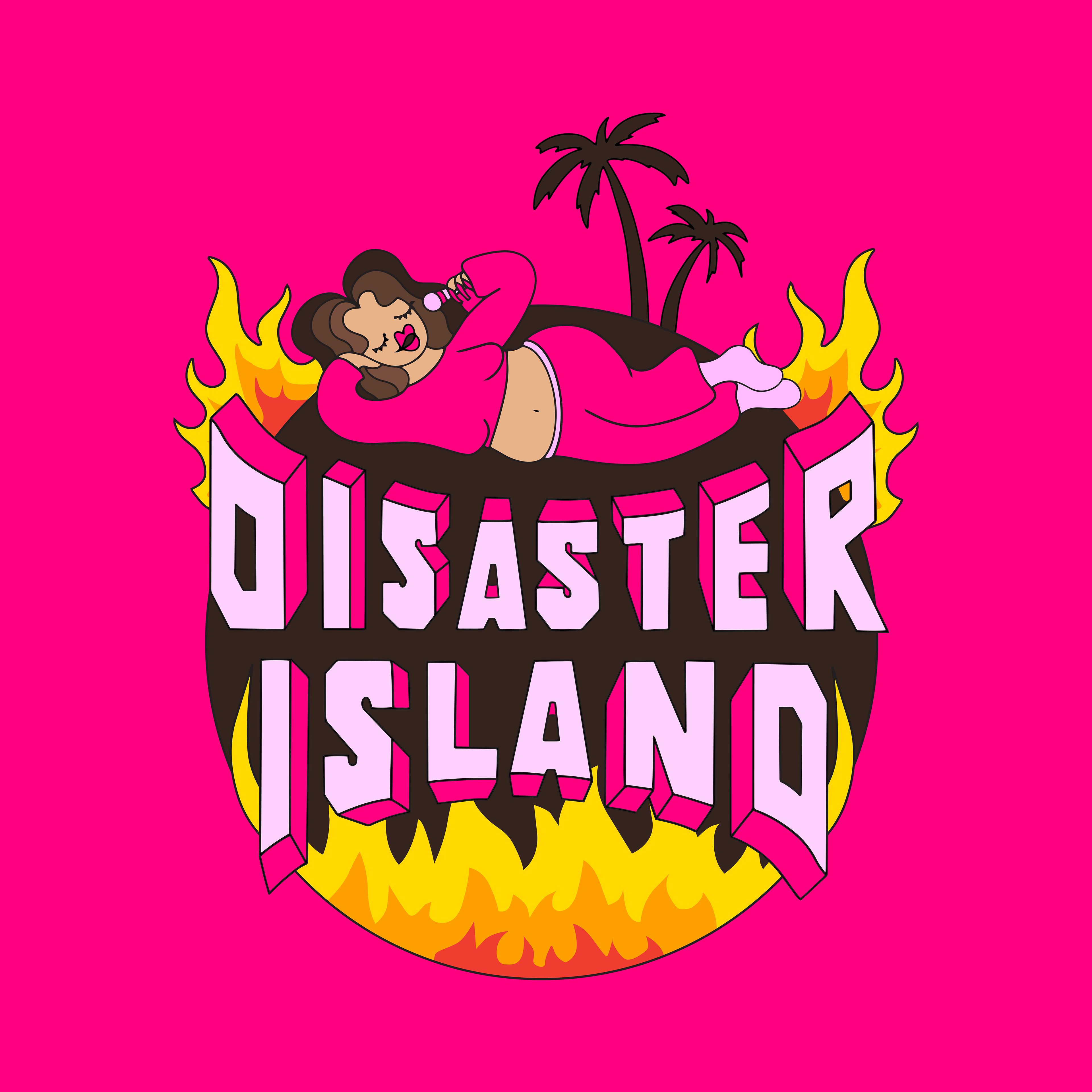
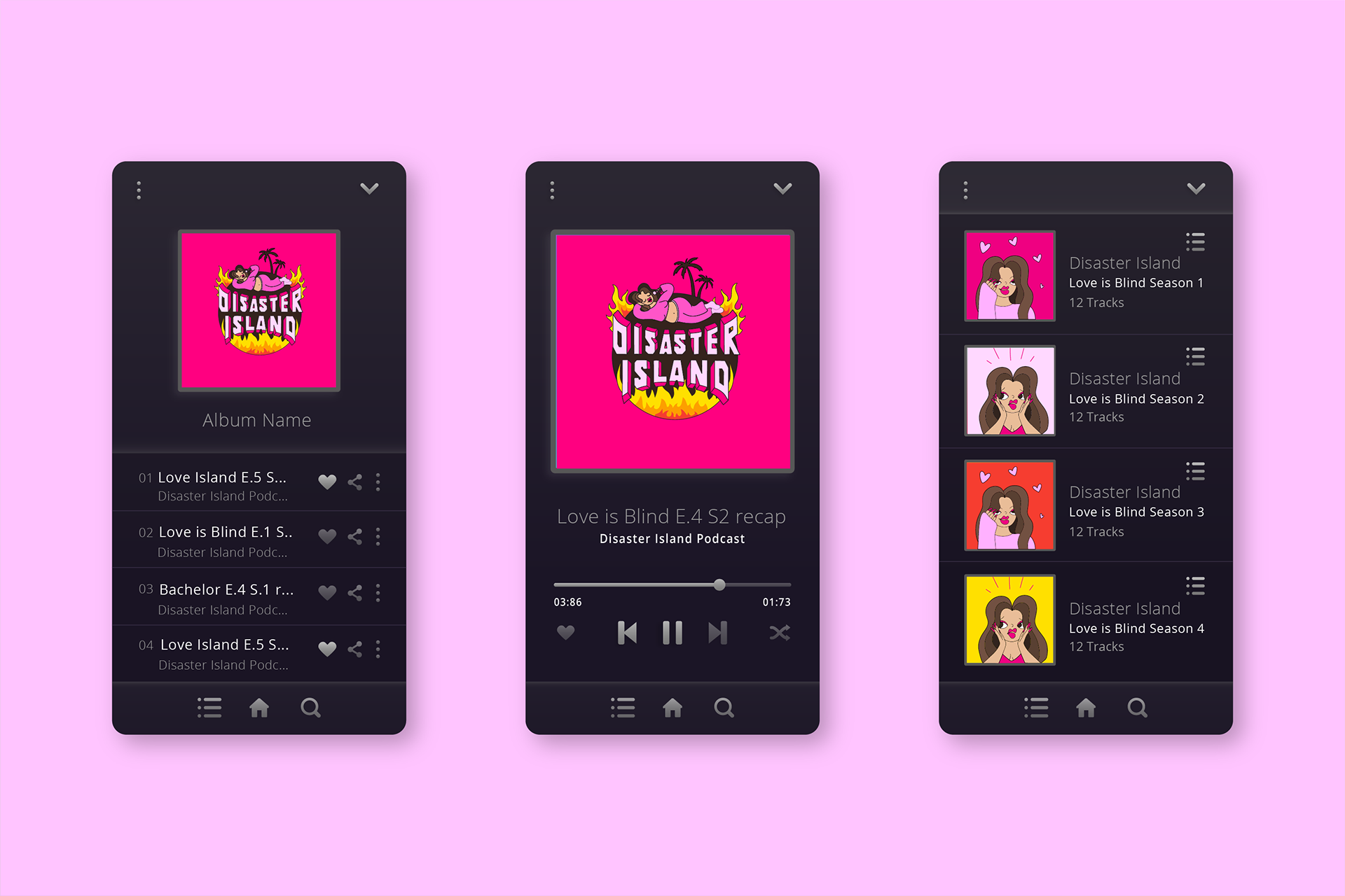
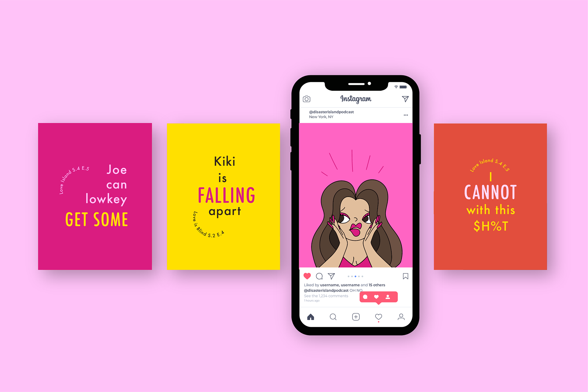
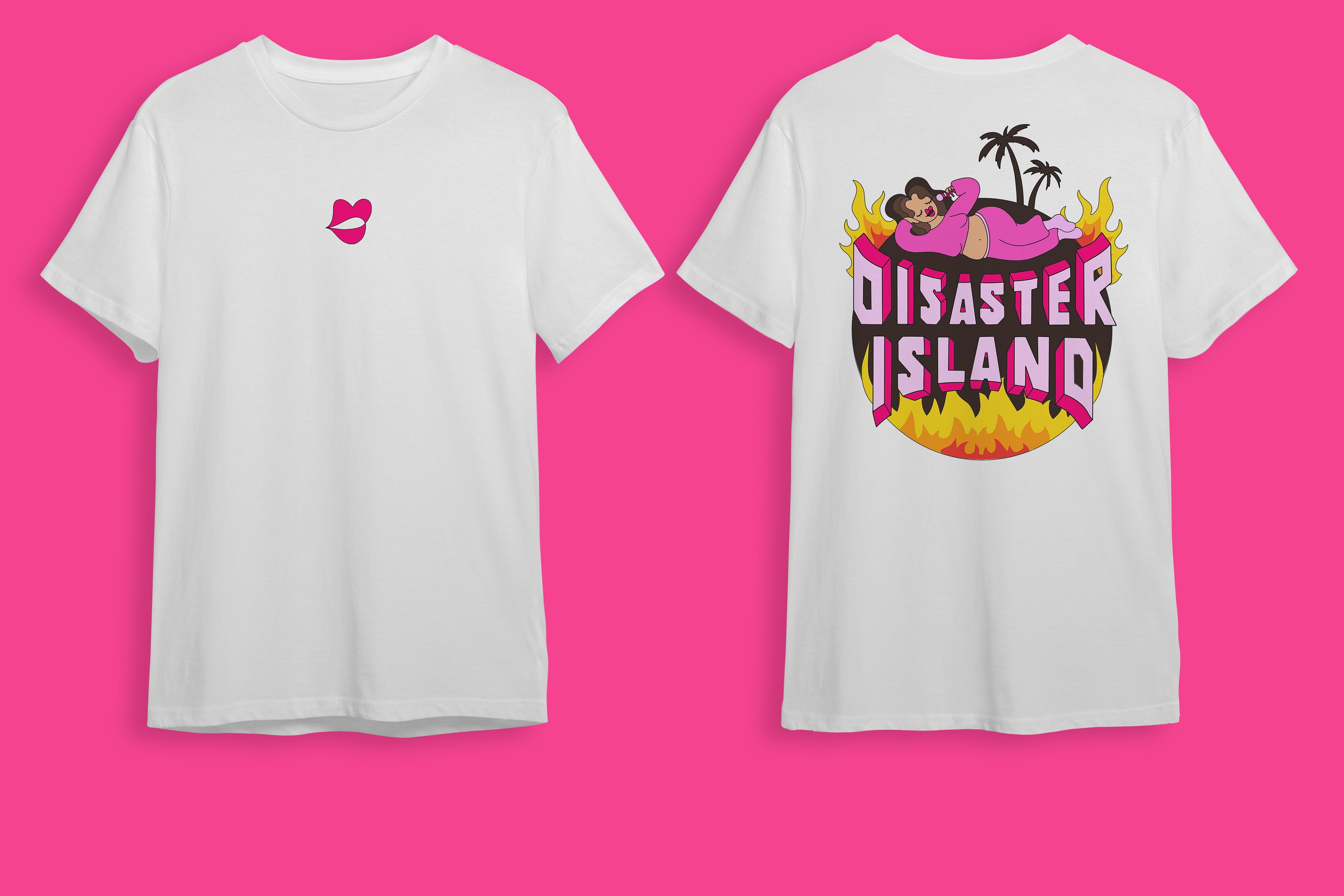
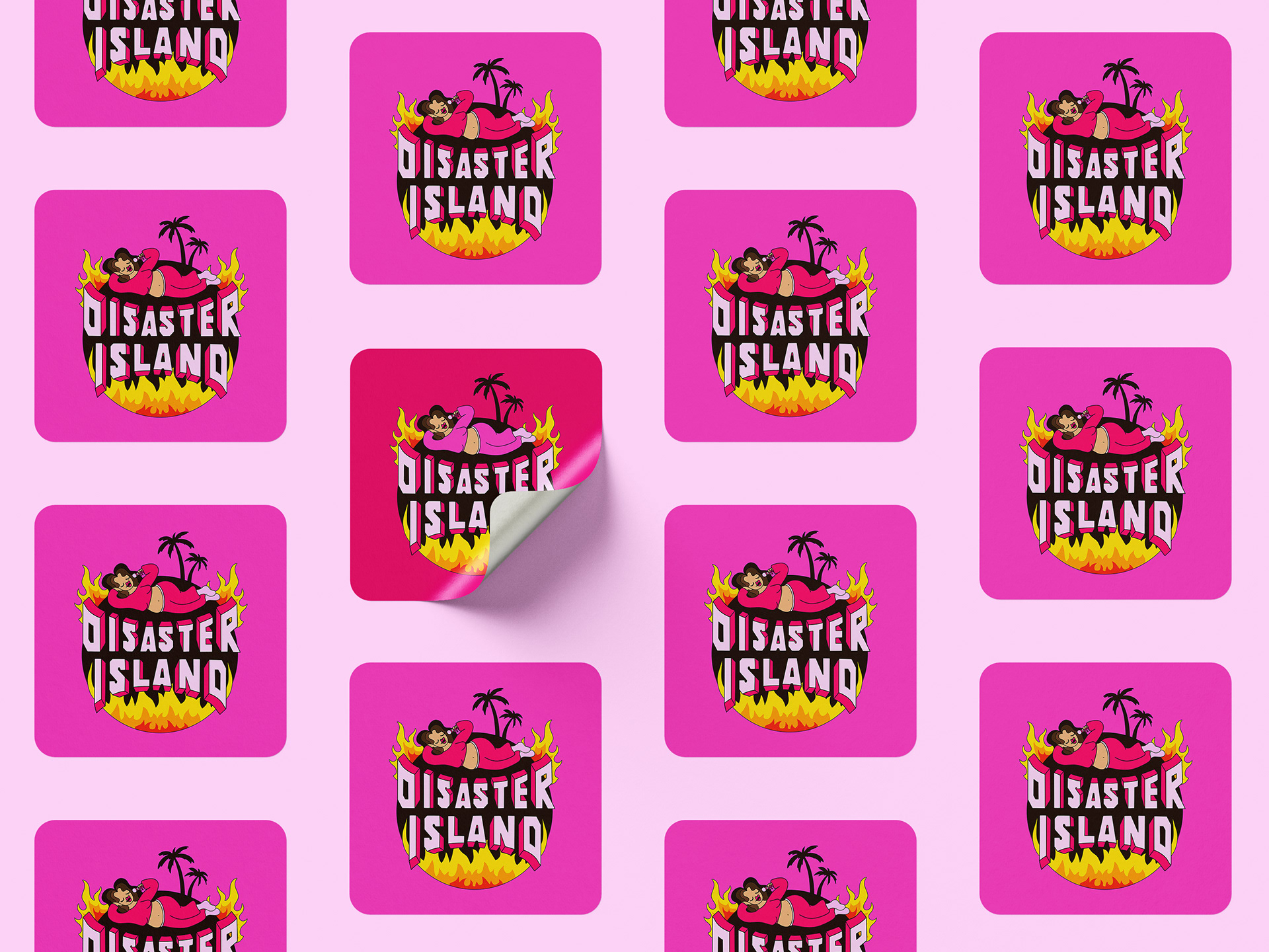
Disaster Island
Commissioned by reality tv podcast host, Annie Kispert, to create cover artwork and typography for podcast "Disaster Island," on Spotify and Youtube.
You may also like
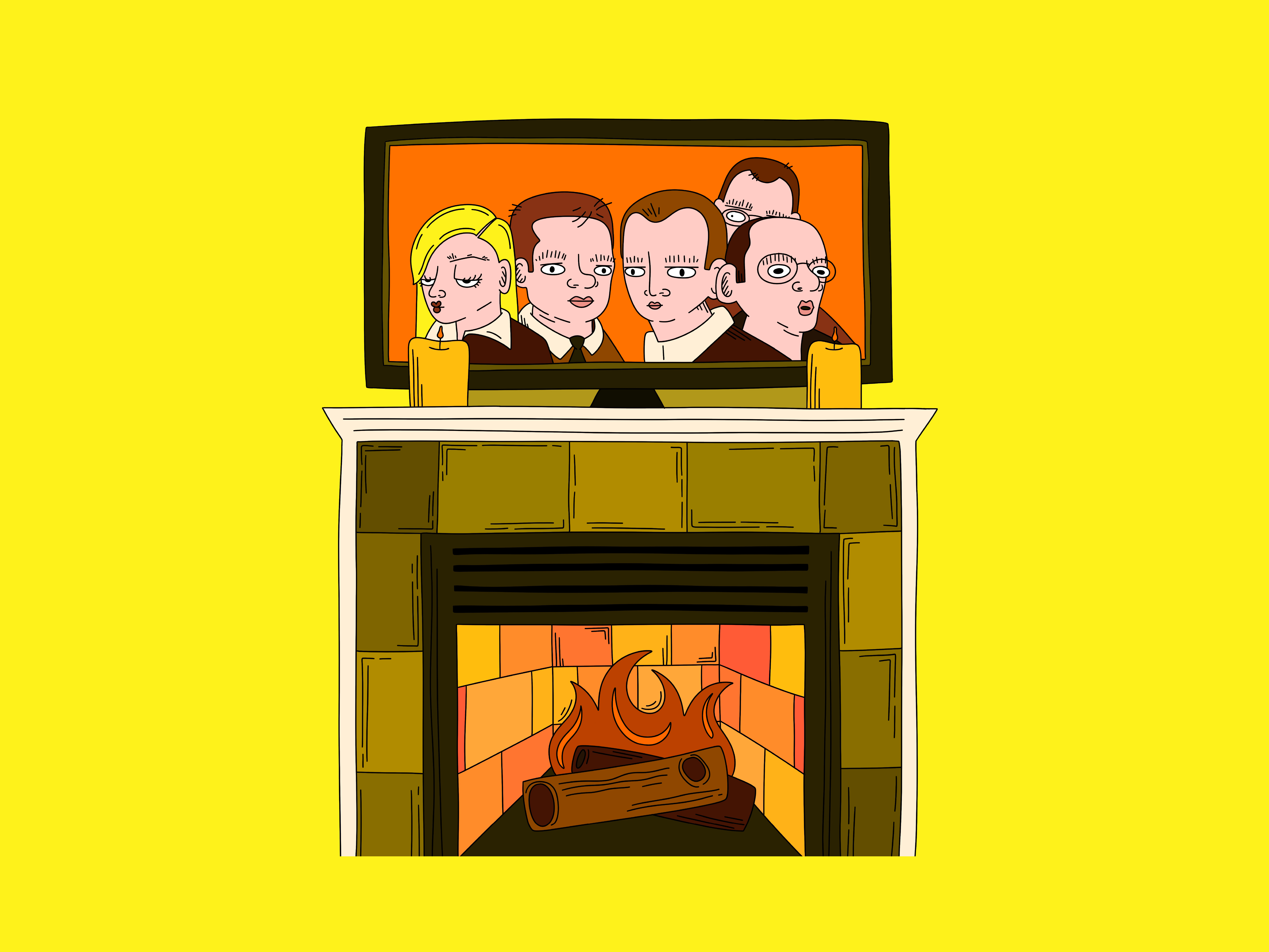
Arrested Development
2025
Through the Window
2024
Tiger
2025
Animation
2023
Pastels
2025
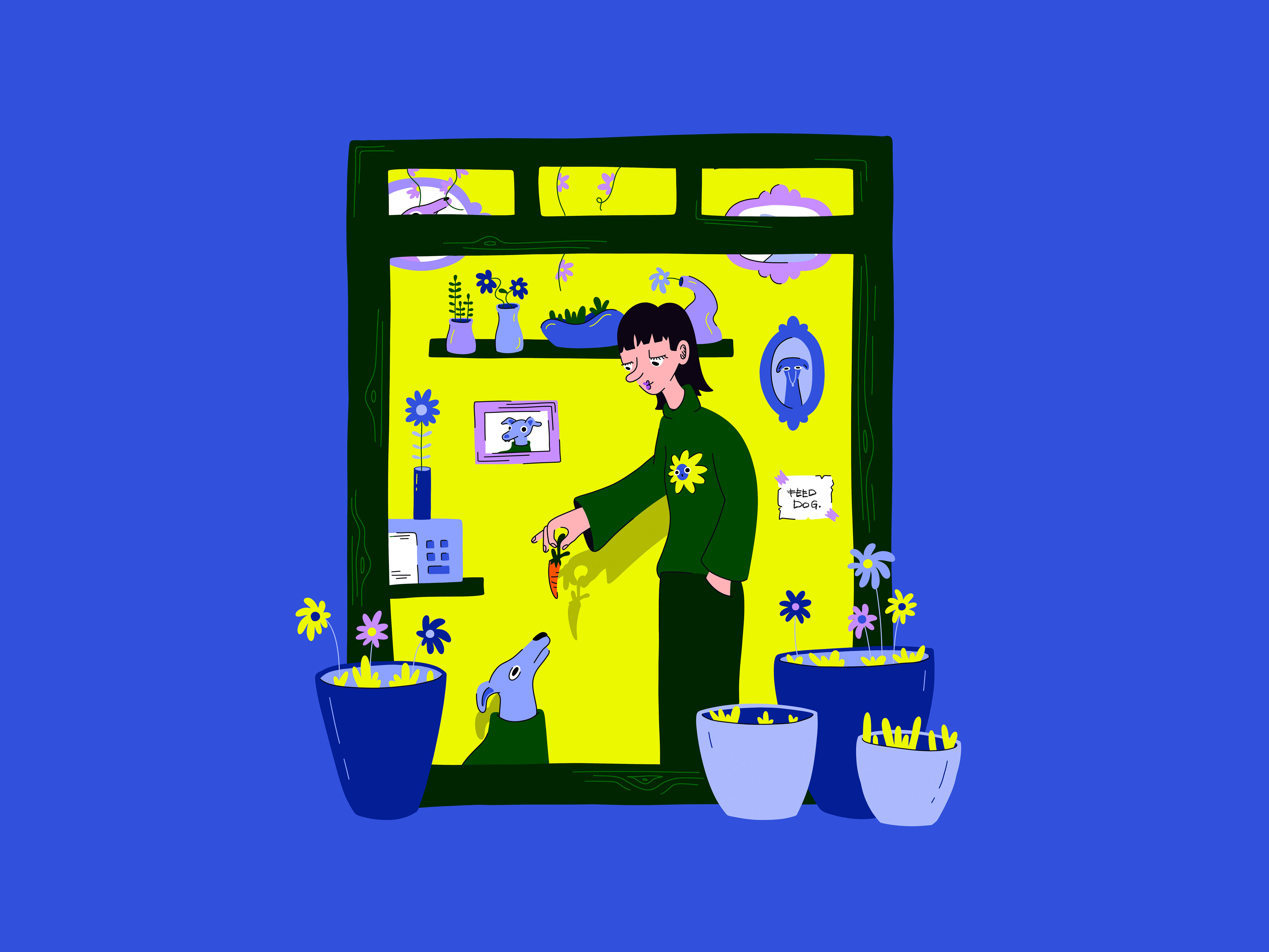
Dog Walking
2025
2024 Summer Olympics
2024
Basketball
2025
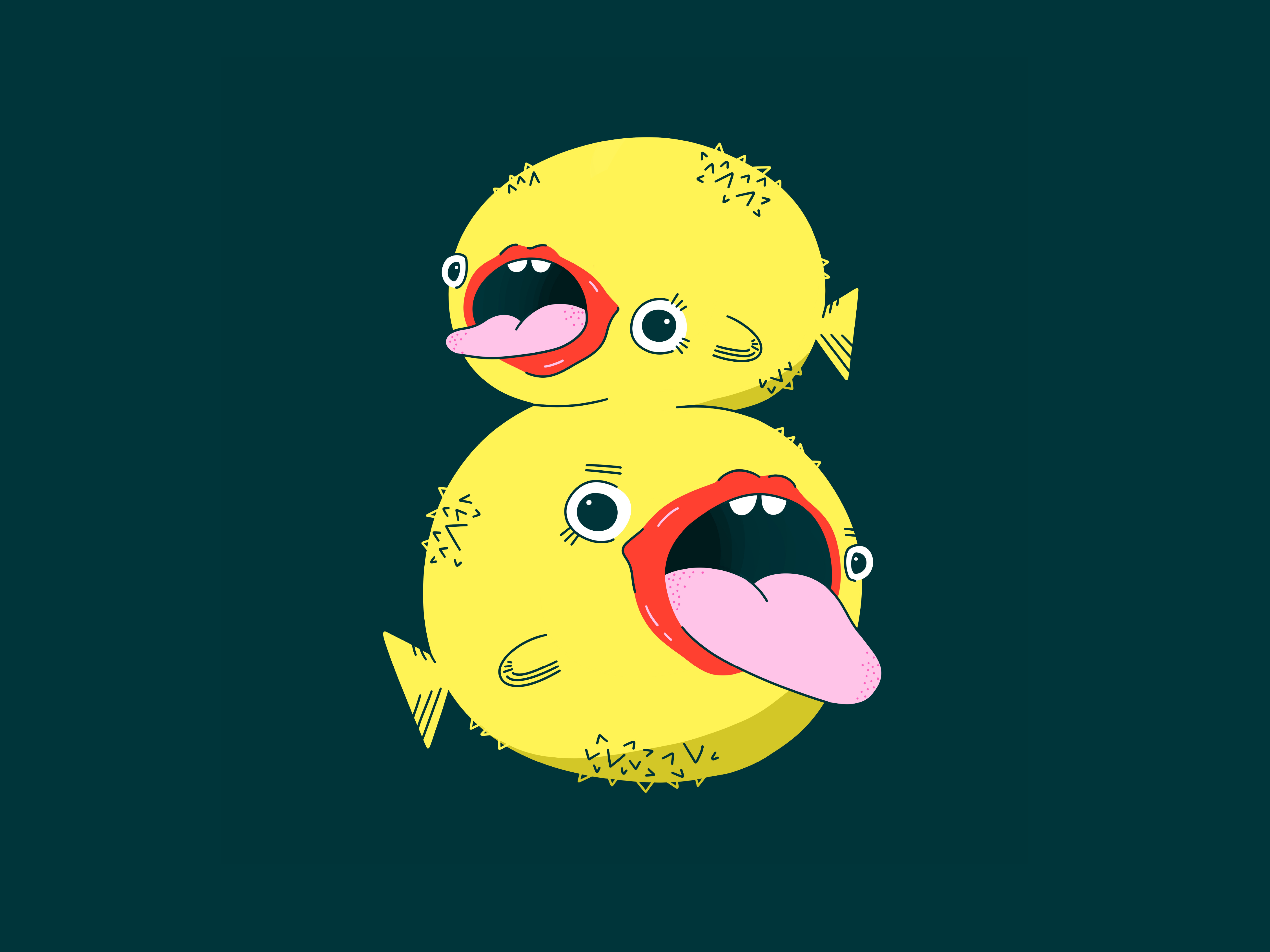
1-9
2025
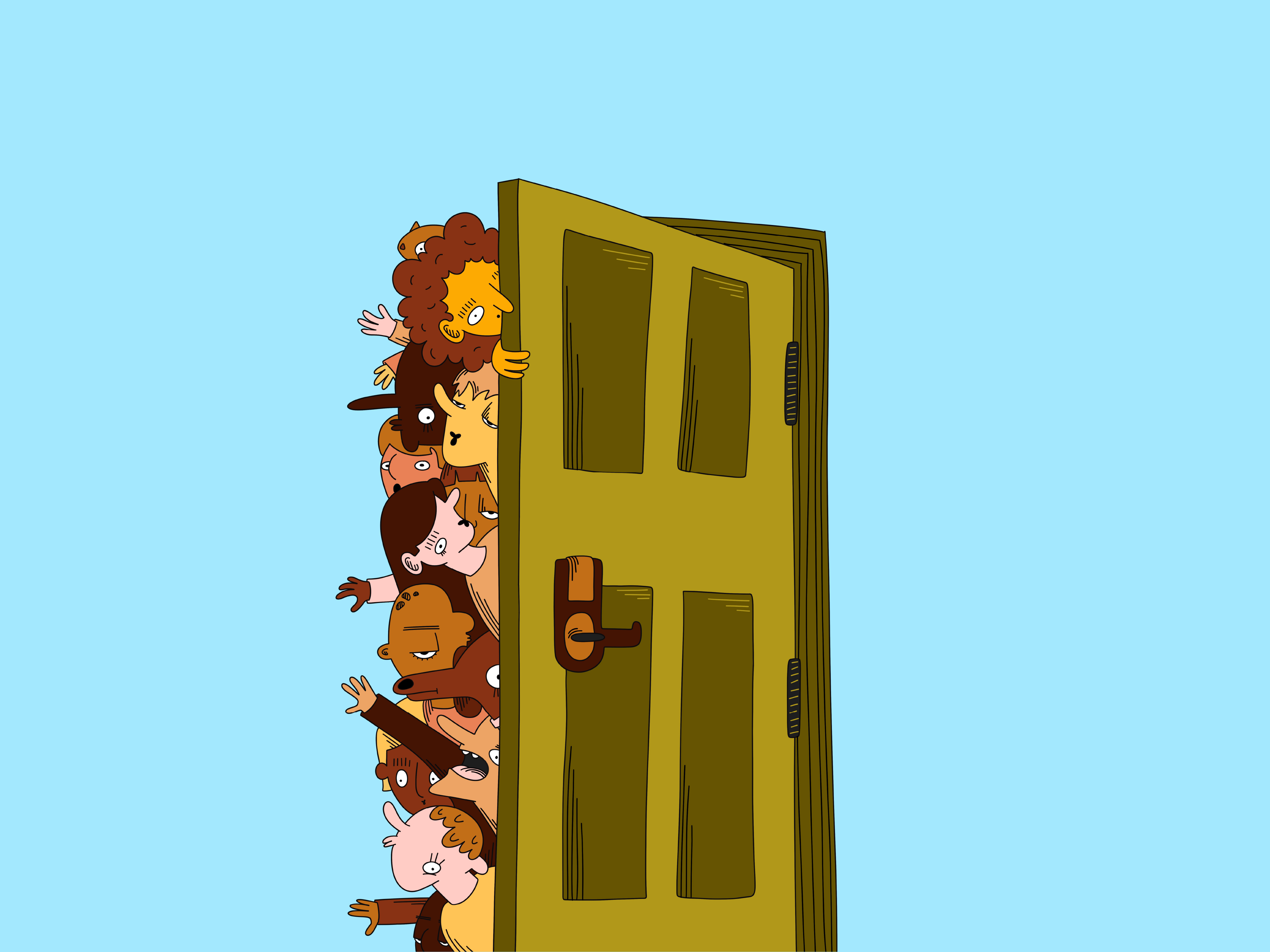
Let Us In
2025
↑
Back to Top