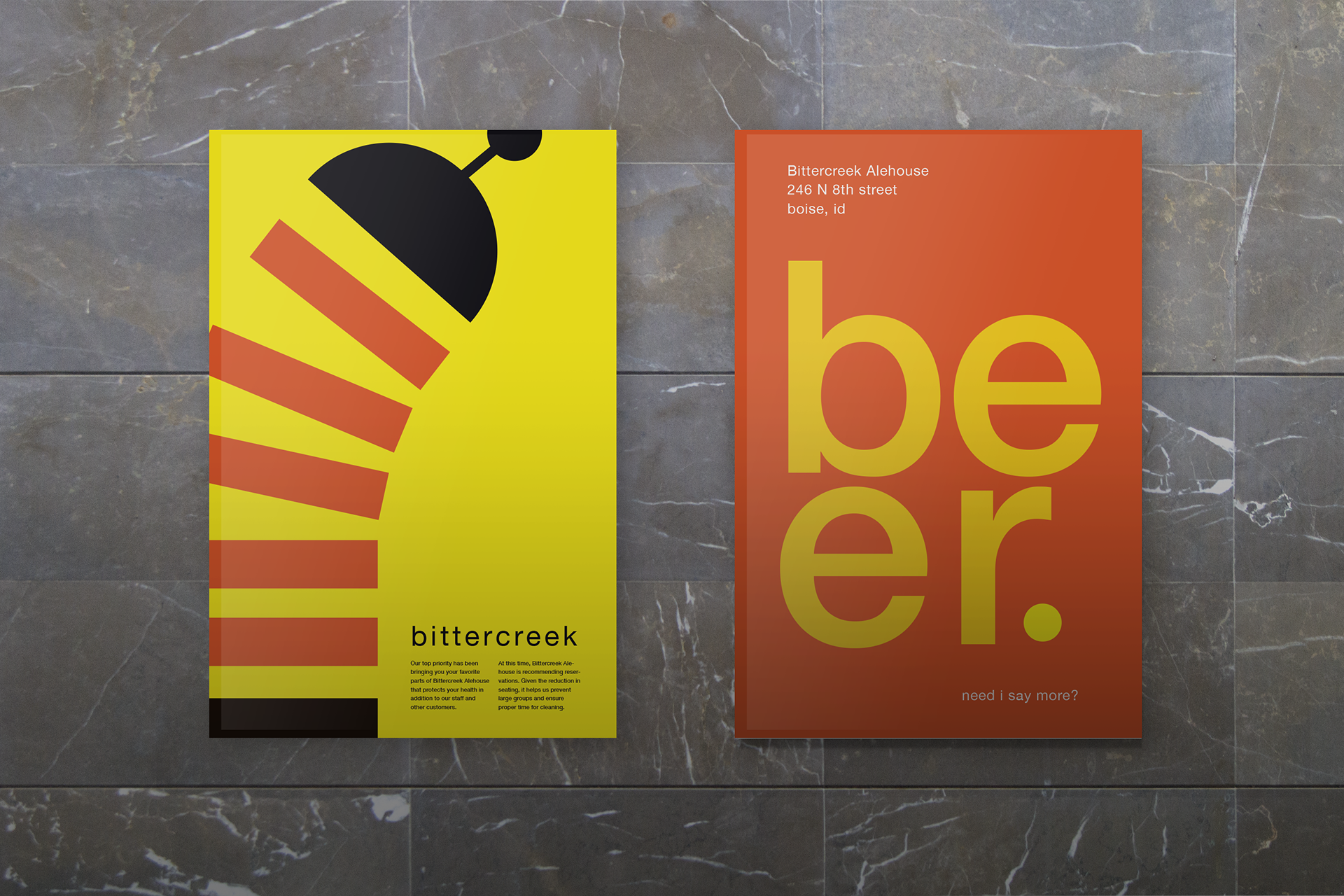
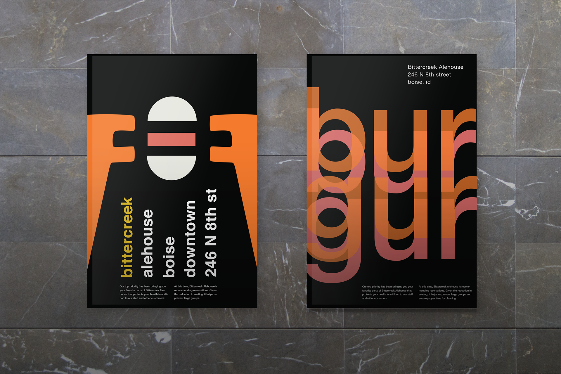
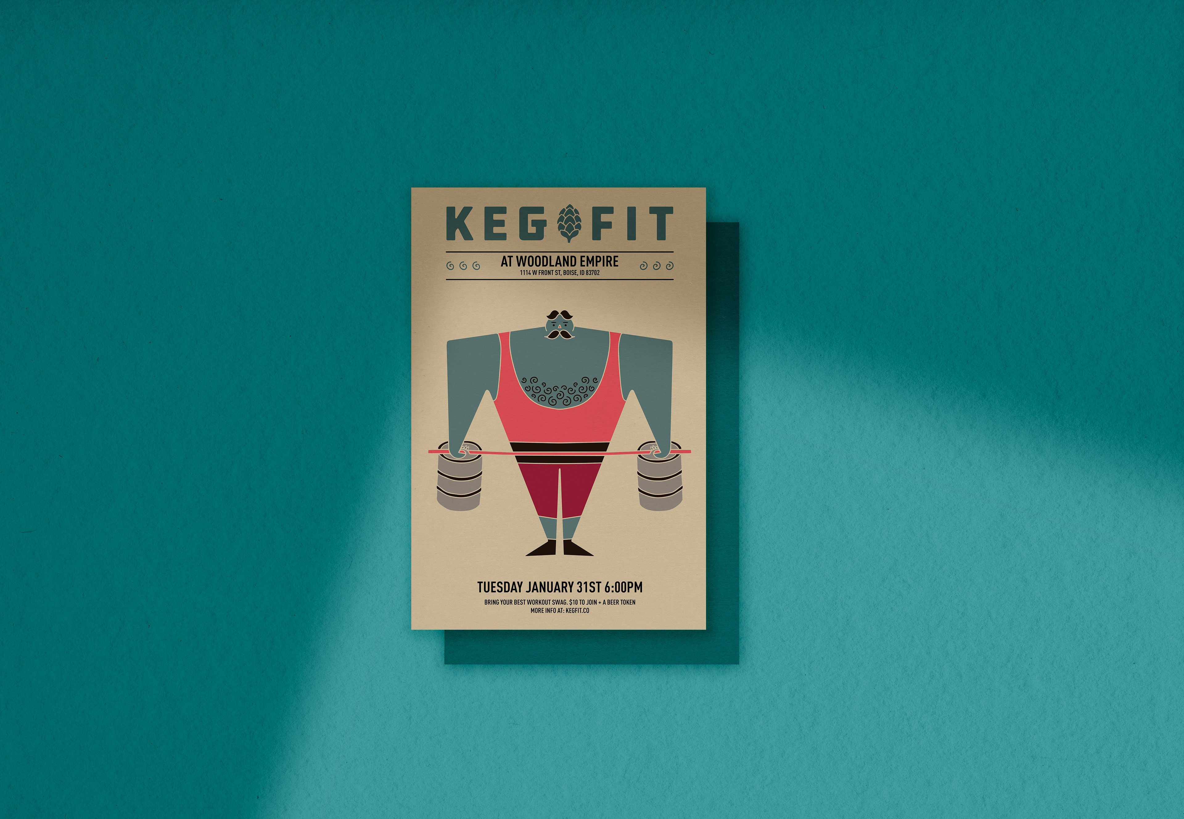
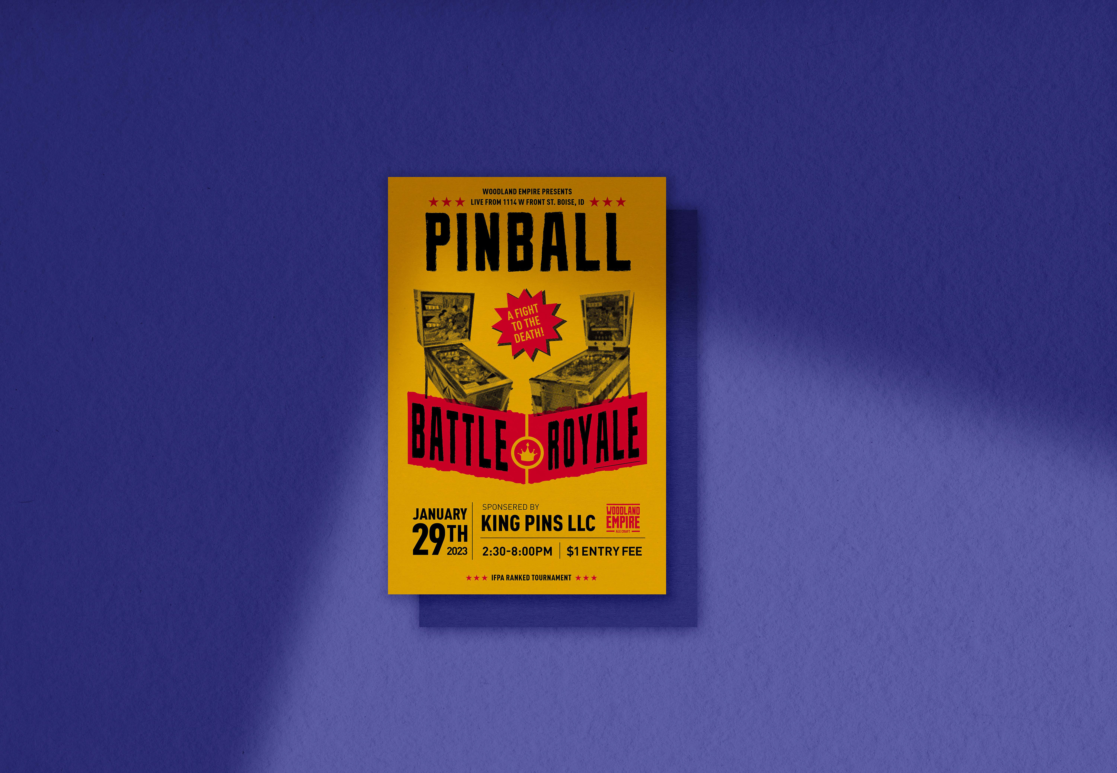
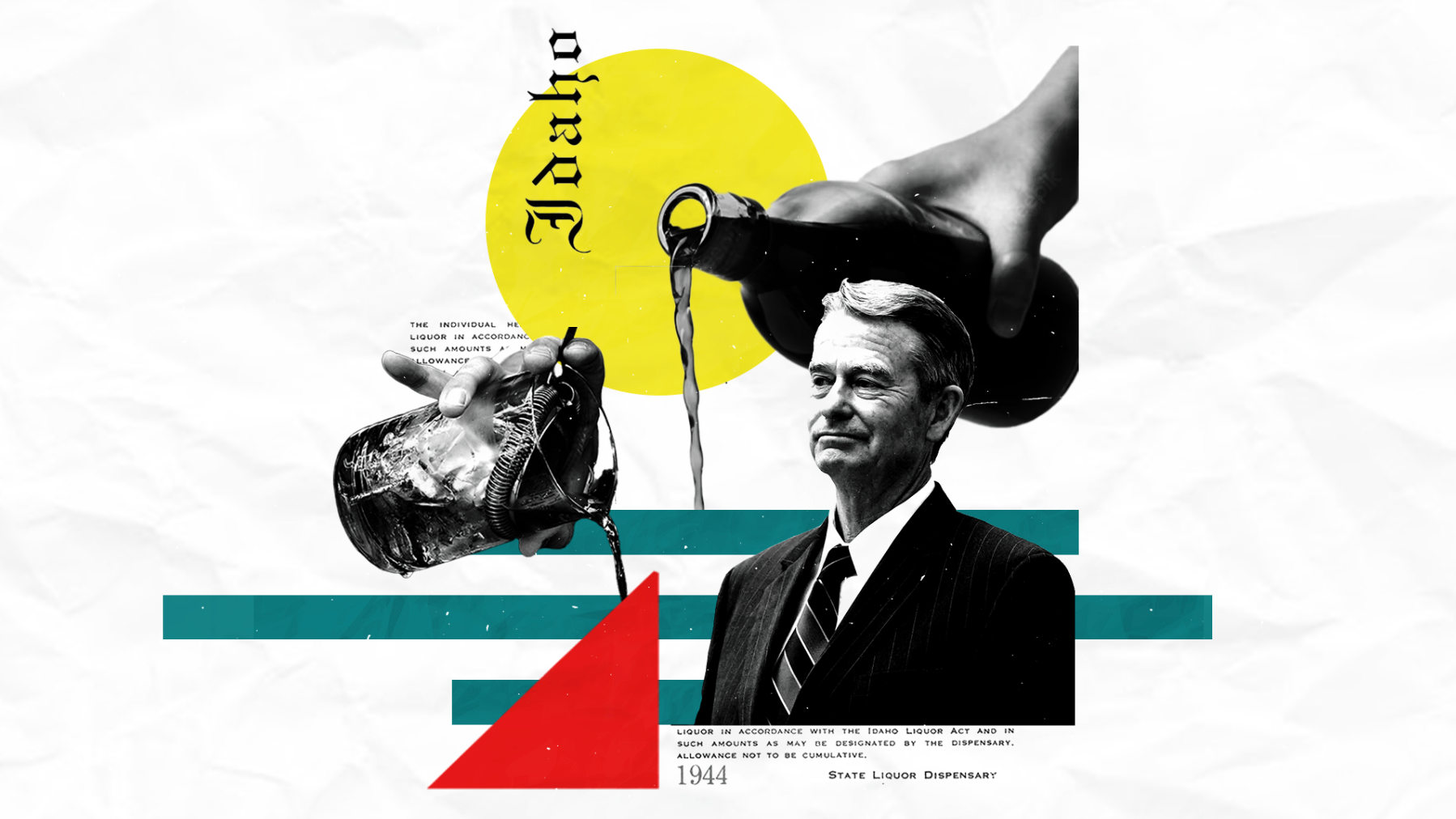
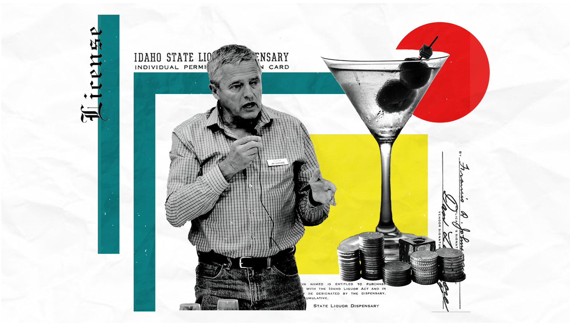
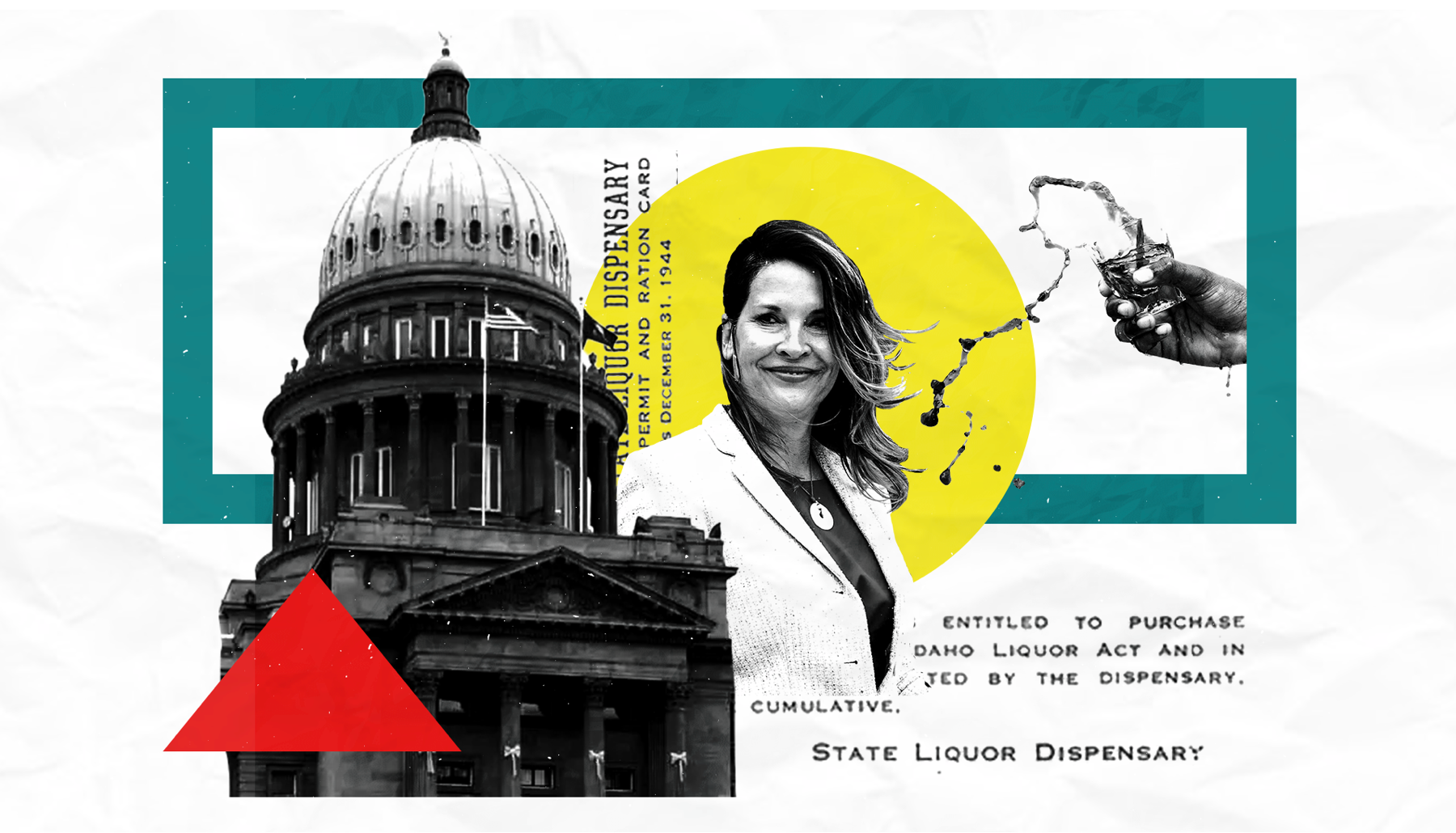
For twenty years the team behind Bittercreek Alehouse, Red Feather Lounge, and Diablo & Sons Saloon contributed to the story of Boise through thoughtful food, good beverage, and great people. Over time, they refined their approach by producing articles, videos, photos, and more; emphasizing locally-sourced food, craft drinks, the culture in the kitchen and on the farm, and everything in-between. Along the way they continue to forge as many meaningful connections as possible to bring our patrons and readers closer to those who make the community and culture what it is.
I was hired by Just Eat Local onto their Design and Marketing team to help build visual identity, content, digital marketing, social media, and public relations for all brands, alongside Creative Director Nathan Warner.
My Role:
Visual Identity
Social / Marketing Strategy
Illustration
Graphic / Apparel Design
Messaging / Copywriting
The Problem:
Just Eat local and its affiliate brands lacked a social and marketing strategy and much of their visual identities had little to no assets to use to help tie the brick and mortar experience to their websites, socials, merch, and more. One of the bigger issues was that Just Eat Local as a parent company had no brand equity with any of the restaurant's patrons.
The Objective:
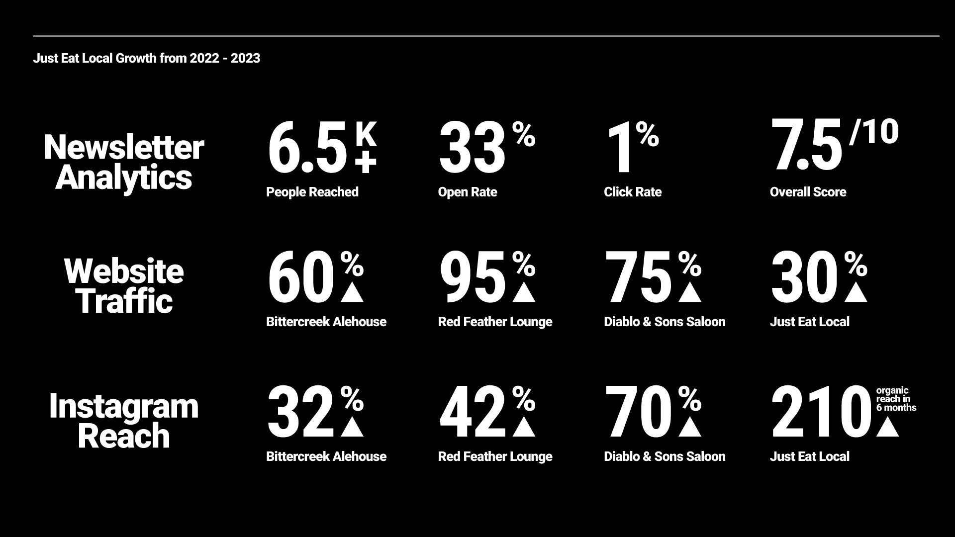
The goal was to roll out refreshed visual Identities for each brand and an overall marketing and social media strategy to increase engagement and awareness of the parent brand. By making each identity more flexible and responsive we would increase our visibility via different channels and create a more youthful look.
Marketing Strategy:
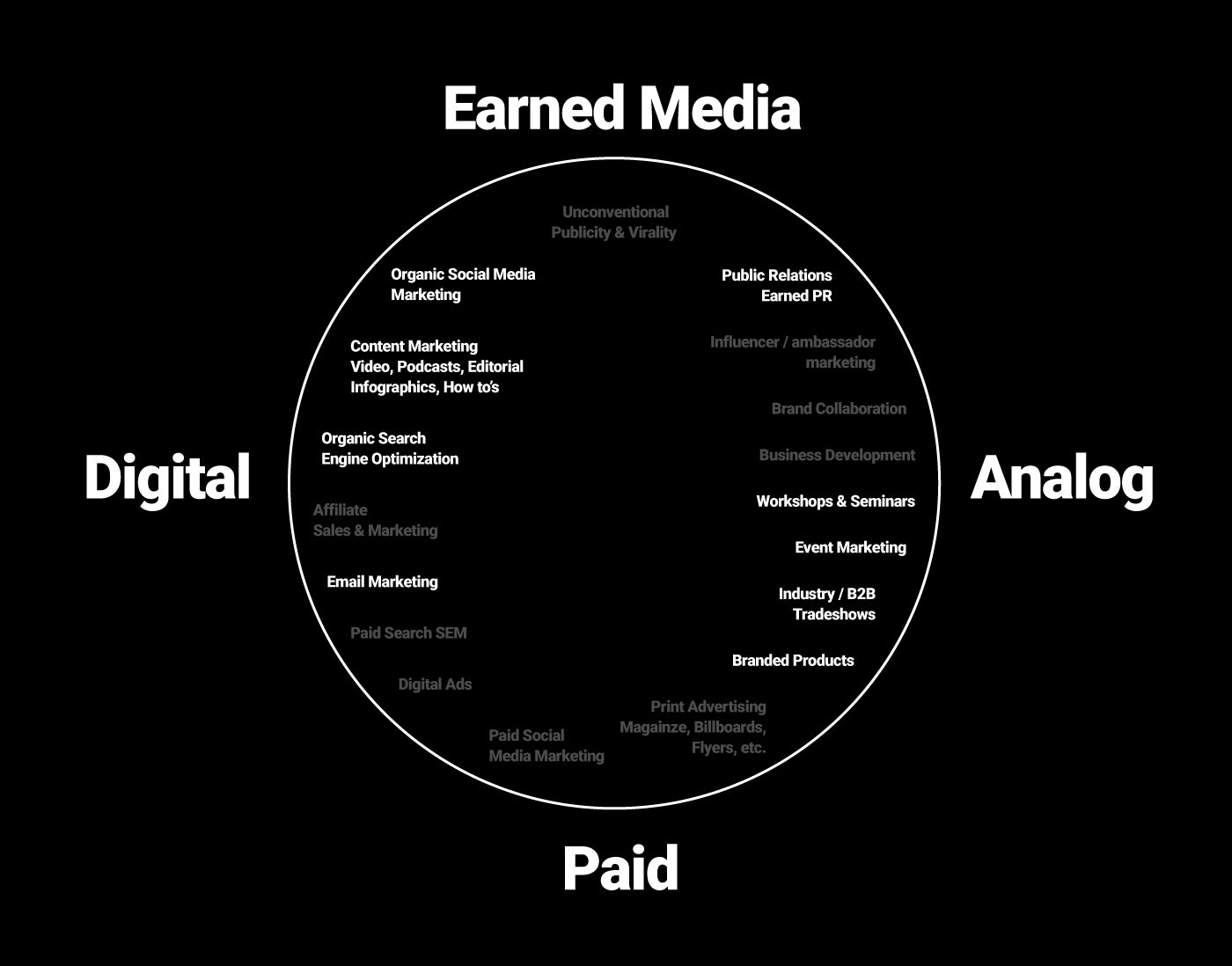
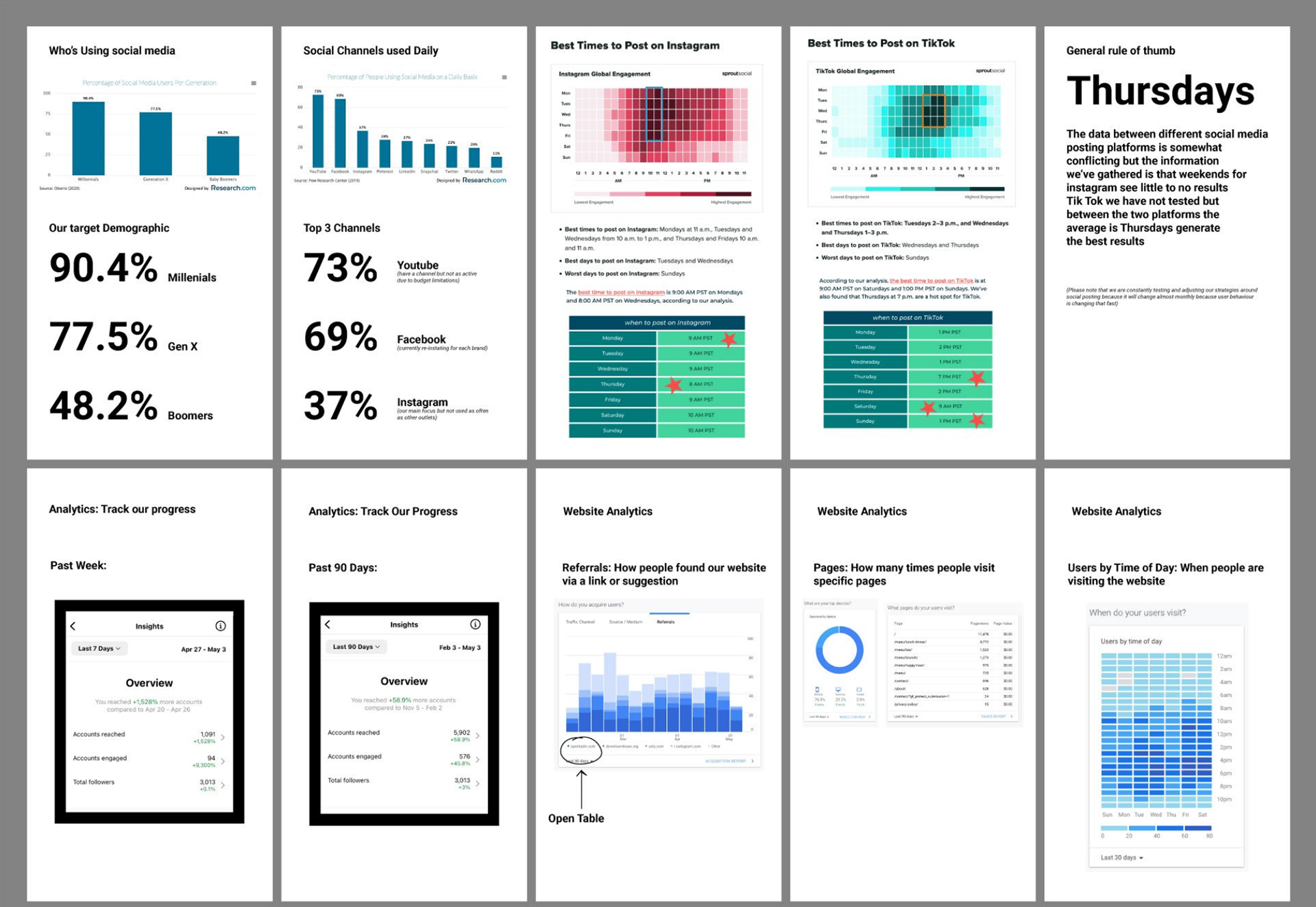
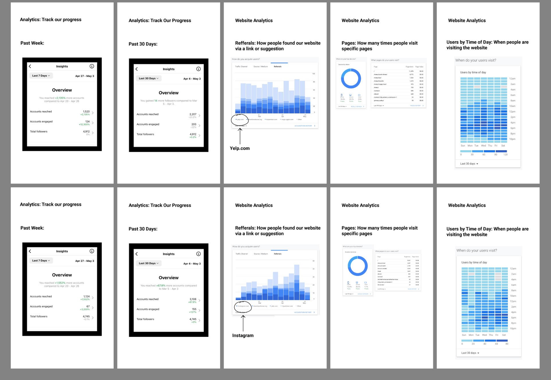
We started with addressing what paid, free, analog, and digital opportunities were available for each brand. Once we established our markets we addressed what platforms, frequency, and budget we had to work with to ensure we were reaching the right people. We then looked at statistics and numbers available to us about who is using those channels, and best practices.
The Solution:
Brooke Foster and Nathan Warner audited the previous brand assets and put together an identity system per brand that had its own unique style: Logo, Color, fonts, patterns, and photo treatments. We then approached Visionkit Studios to help us with photograph per brand. Email newsletter, Articles, & posting on social media would generate more engagement with a consistent look and feel to help viewers better understand the brands.
Social Media Strategy:
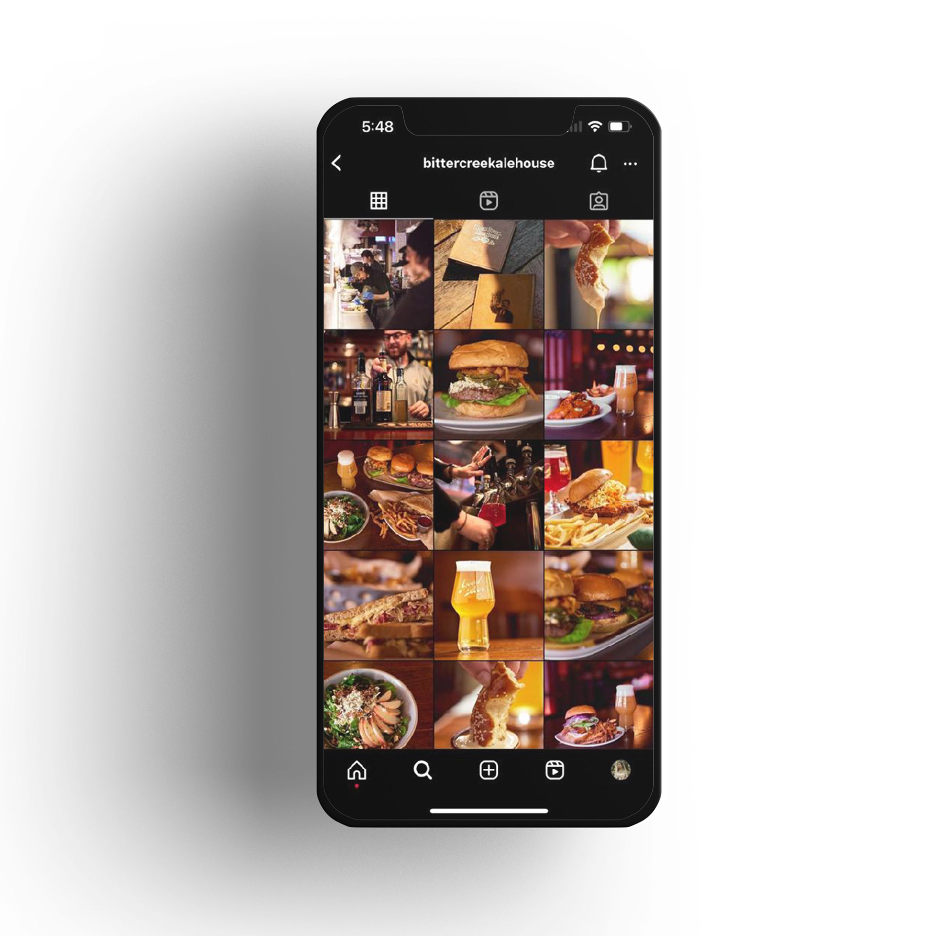
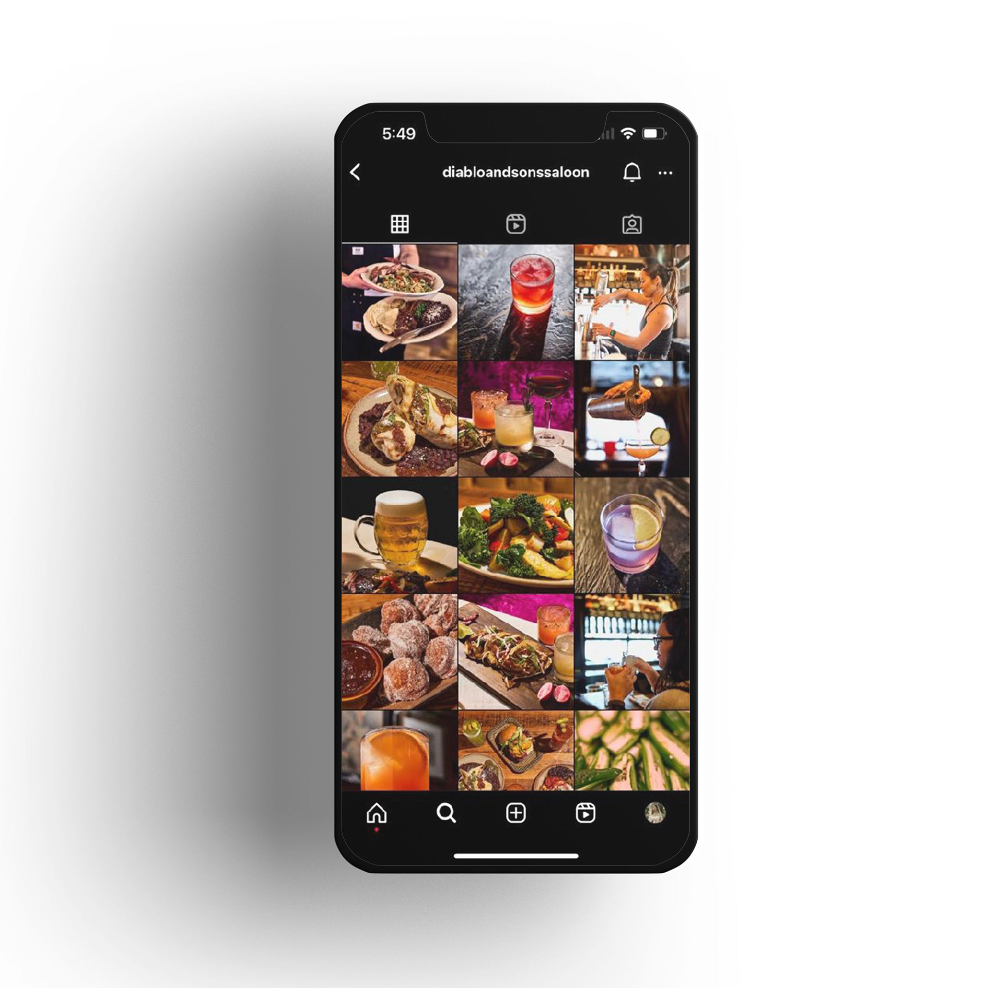
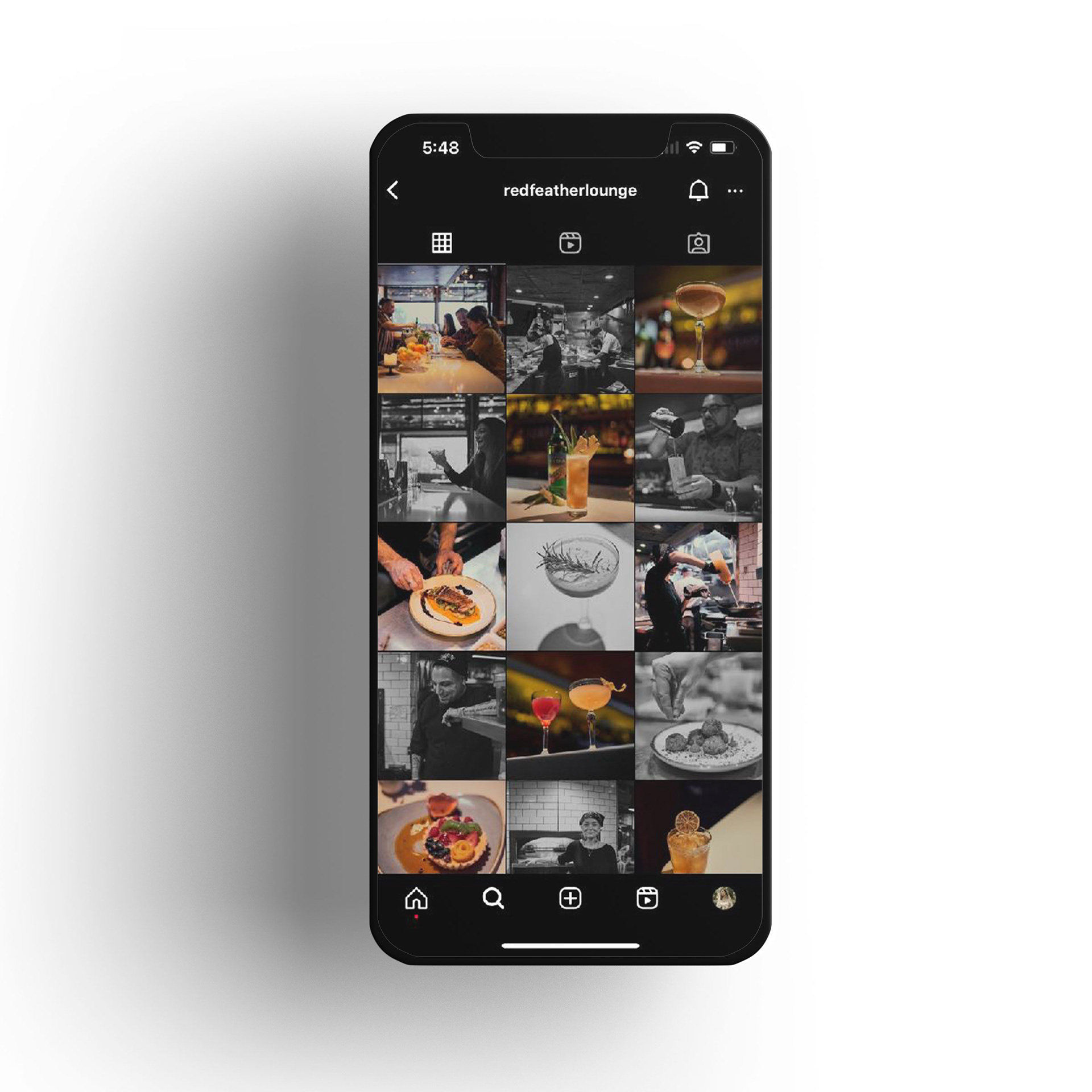
We researched where our engagement was with the previous usage of instagram. We implemented the photos from Visionkit into our feed to help patrons better understand what the “vibe” of each restaurant is, while focusing our time and energy on making engaging reels that boosted our engagement and better told the story of how our food is made.
Photography:
We needed new photos and photo treatments to better help tell each brand's story. We spent a month working on a style guide that helped us better articulate our goals for working with Visionkit and to better help them understand where we were headed. The result was 3 treatments that give each restaurant a unique visual appeal.
RED FEATHER LOUNGE
ENVIRONMENT:
• Modern lounge
• Dressy or casual (Make your own experience)
• Cocktail focused
• Dressy or casual (Make your own experience)
• Cocktail focused
STYLING:
• Darker backgrounds
• Food & cocktails presented simply
• Focus on single items
• Include just as many B&W as colored photos
• Food & cocktails presented simply
• Focus on single items
• Include just as many B&W as colored photos
PROPS:
• Cocktail glasses
• Ingredients of drinks or food
• Marble top (bar) with darker tones
• Ingredients of drinks or food
• Marble top (bar) with darker tones
LIGHTING:
• Dark and moody
BITTERCREEK ALEHOUSE
ENVIRONMENT:
• Relaxed Pub
• Playful/Messy food
• Beer focused
• Playful/Messy food
• Beer focused
STYLING:
• Dark Wood Surfaces
• Food on Butcher / parchment Paper or wood surface
• French fries spilling over
• Beer overflowing
• Backdrop should encapsulate bar/restaurant as a blur, food and beverage focused
• Food on Butcher / parchment Paper or wood surface
• French fries spilling over
• Beer overflowing
• Backdrop should encapsulate bar/restaurant as a blur, food and beverage focused
PROPS:
• Beer Glasses
• Long wall of beer taps
• Butcher / parchment Paper
• Coasters
• Long wall of beer taps
• Butcher / parchment Paper
• Coasters
LIGHTING:
• Mildly bright and warm
DIABLO & SONS SALOON
ENVIRONMENT:
• Saloon inspired
• Minimal yet loose. Ingredients / props surrounding the food
• Beer, Whiskey, and Mezcal
• Minimal yet loose. Ingredients / props surrounding the food
• Beer, Whiskey, and Mezcal
STYLING:
• Mix of dark and light surfaces
• Food on wood, newspaper or light brownish ceramic paired with drinks
• ingredients on the table
• Backdrop should encapsulate bar/restaurant as a blur, food and beverage focused
• Food on wood, newspaper or light brownish ceramic paired with drinks
• ingredients on the table
• Backdrop should encapsulate bar/restaurant as a blur, food and beverage focused
PROPS:
• Liquor bottles
• Textured surfaces
• Hand made ceramic plates / wood plates
• Textured surfaces
• Hand made ceramic plates / wood plates
LIGHTING:
• Mix of dark and Soft light
Apparel:
Some of the apparel on the floor at Bittercreek Alehouse and Diablo and Son’s had been in circulation for years. We felt it was time to start creating pieces that would be comparable to items we saw in the market. With a few days of research we found some commonalities in the market that seemed to sell through well to those who regularly attended Bittercreek and Diablo. We designed shirts and hats that were geared towards our customers and in doing so we’ve seen a huge spike in apparel sales.
Illustrations:
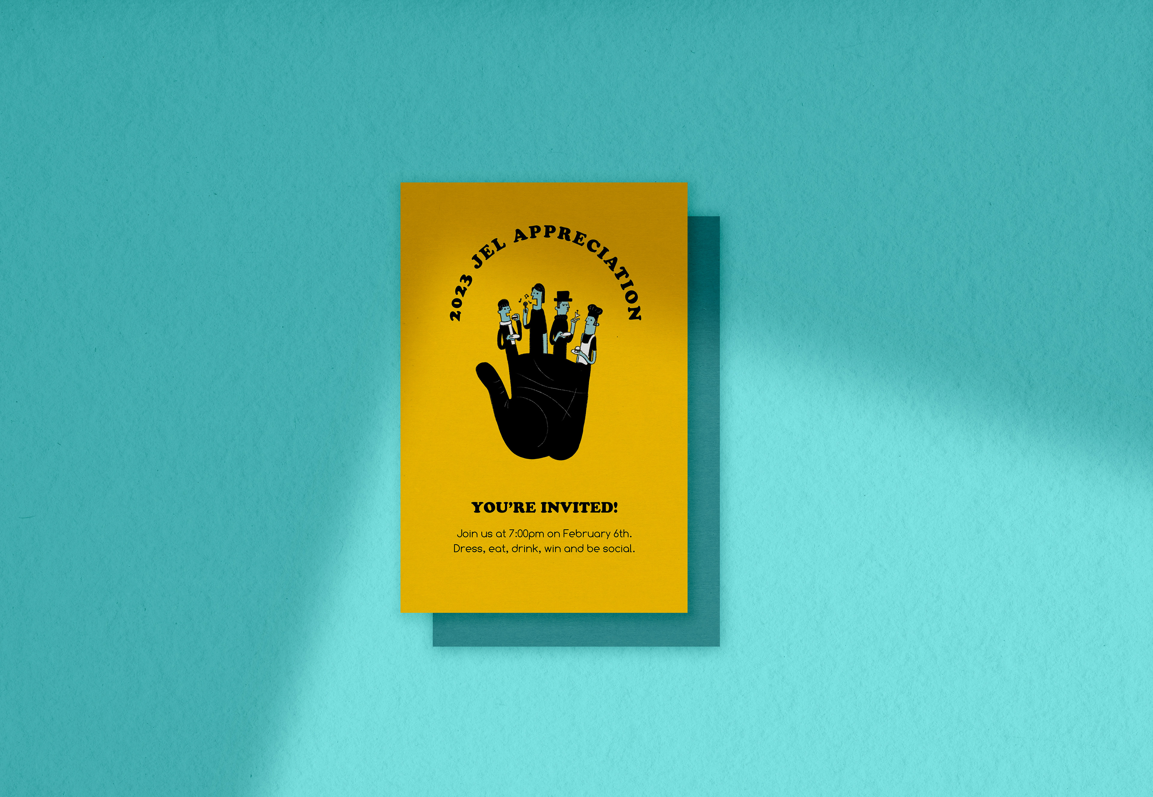
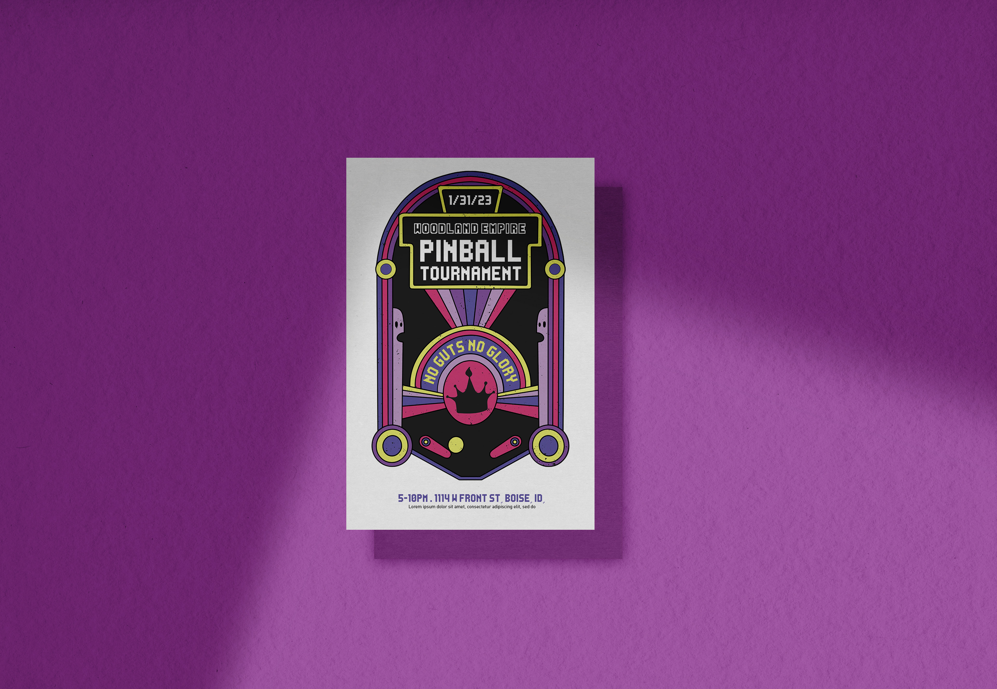
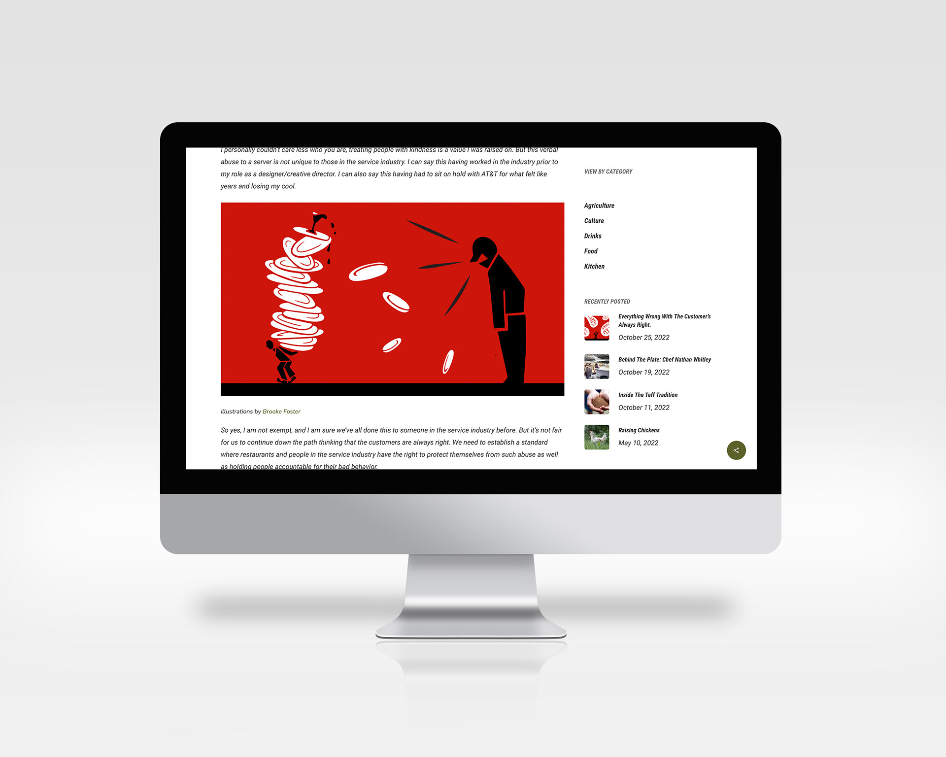
I was tasked with illustrating on multiple projects, ranging from Editorial, Apparel, Mascot Design, etc. These illustrative elements adding visual interest and a personal touch to each brand.
