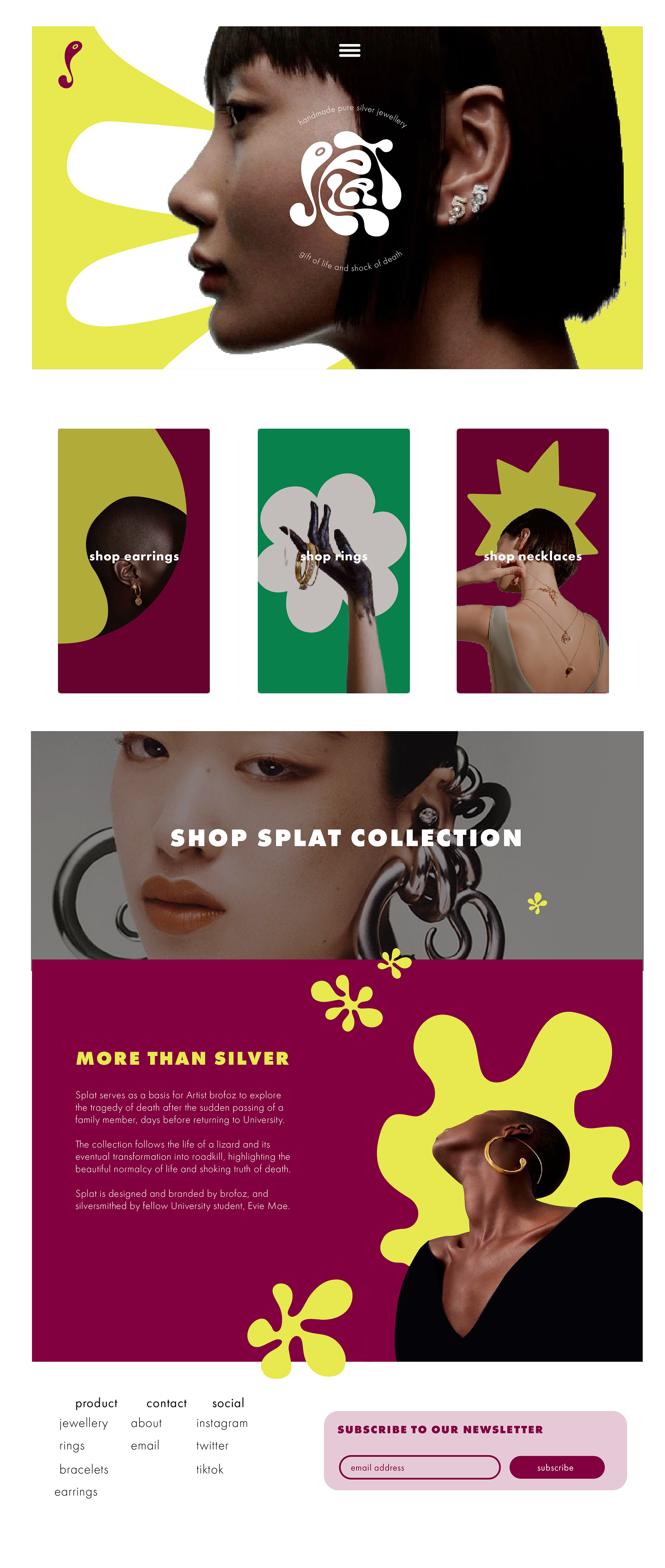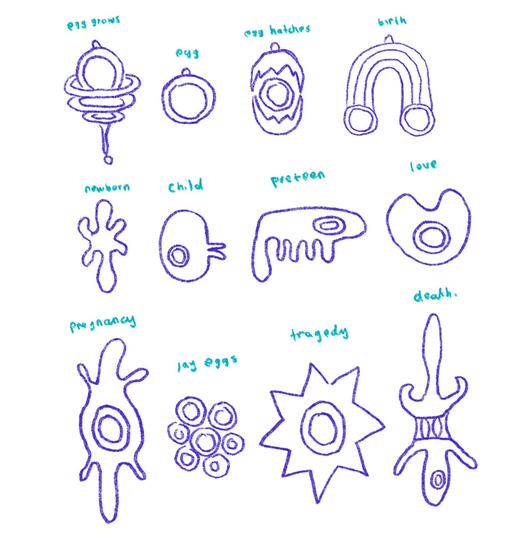
Splat serves as a basis to explore the tragedy of death after the sudden passing of a family member, days before returning to my MA Illustration program at UCA.
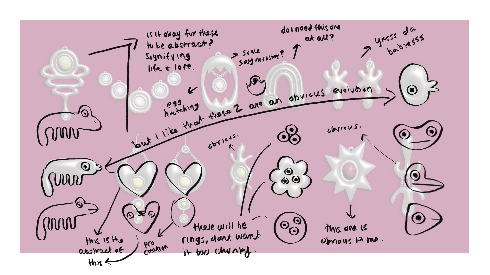
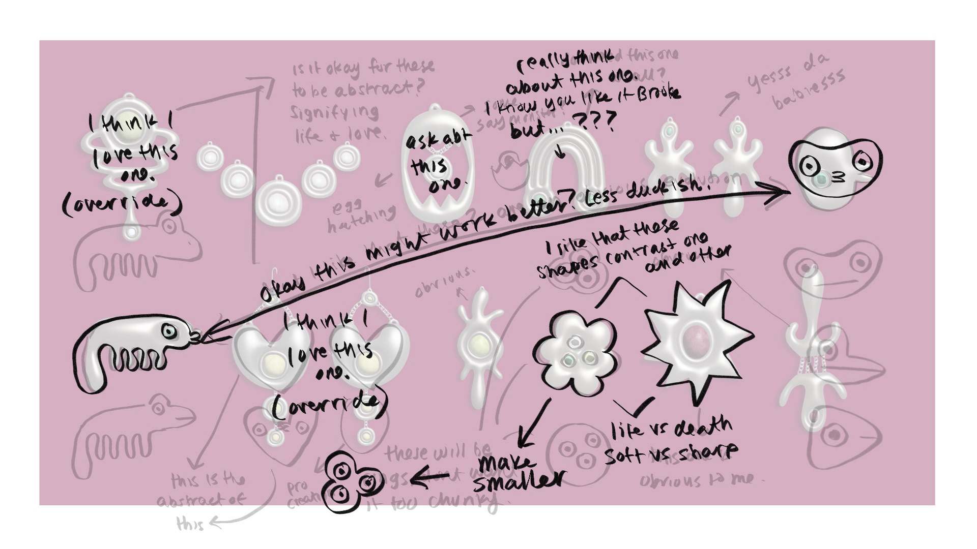
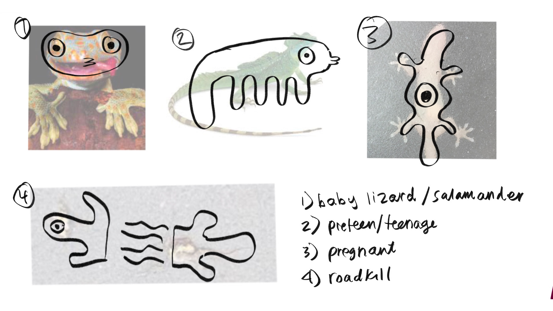
This experimental jewelry collection follows the life of a lizard and its eventual transformation into roadkill, highlighting the beautiful normalcy of life and shocking truth of death. Splat is designed and branded by me and cast in pure silver by fellow University student, Evie Mae.
Additionally, the project aims to challenge what "illustration" can look like, and hopes to successfully combine two dissimilar artistic endeavors into one cohesive piece.
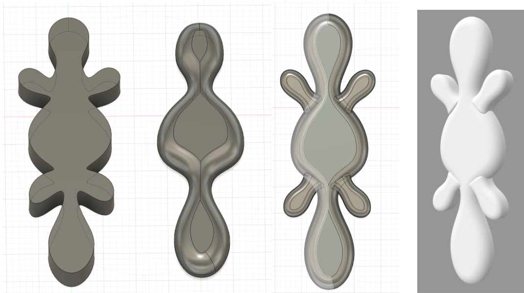
After the illustrations were complete, I provided my partner with a digital visual to better help us understand the general vision.
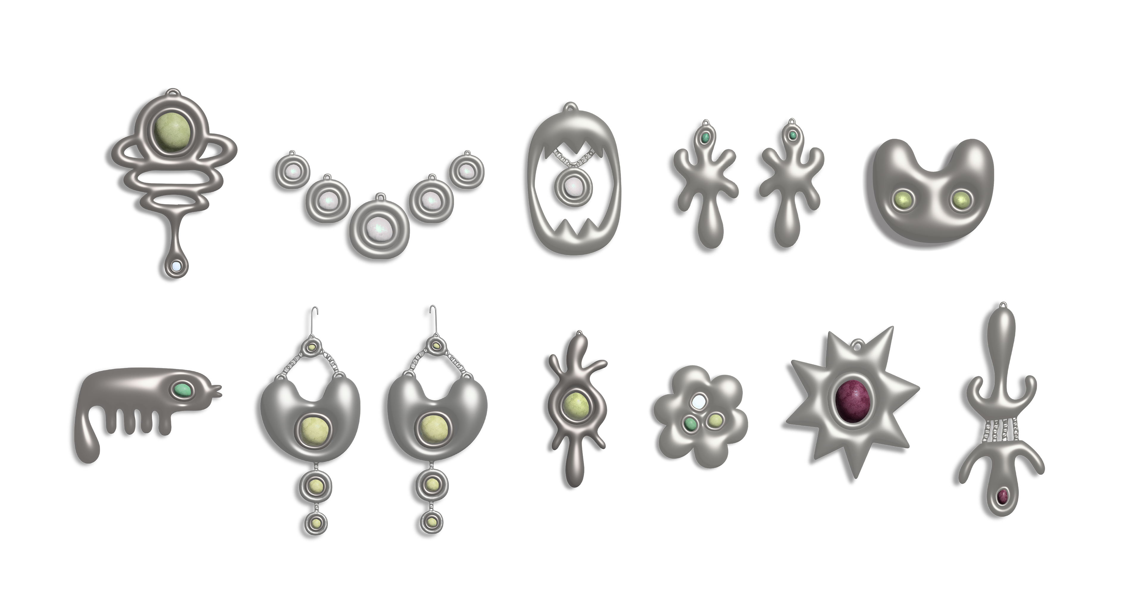
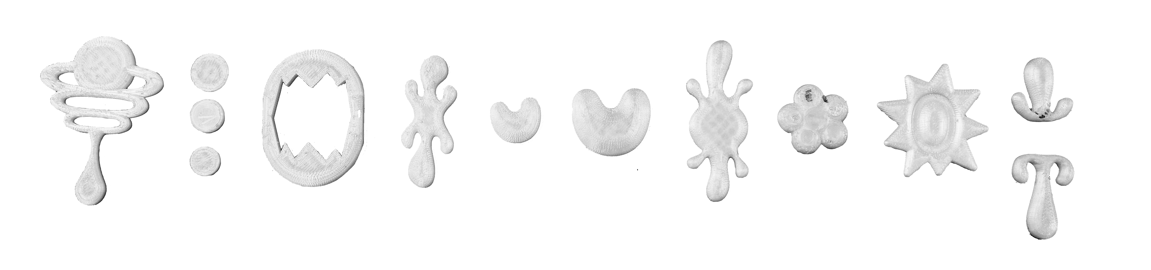
I next used 3D modeling program Fusion 360 to sculpt the two dimensional illustrations in preparation for printing and casting.
After the completion of 3D modeling, the files were sent to a printer and 3D printed to act as molds for the silver casting process.
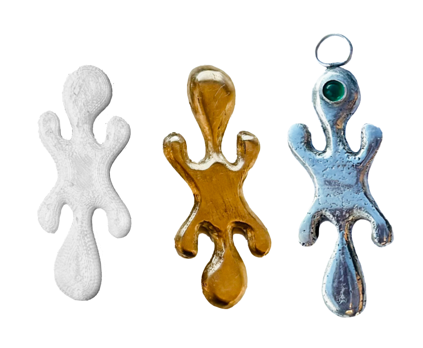
Here, you can see the three phases in the physical making process of the collection. The plastic molds via the 3D printer were then cast in bronze. Following bronze casting, Evie and I then felt comfortable casting again in silver.
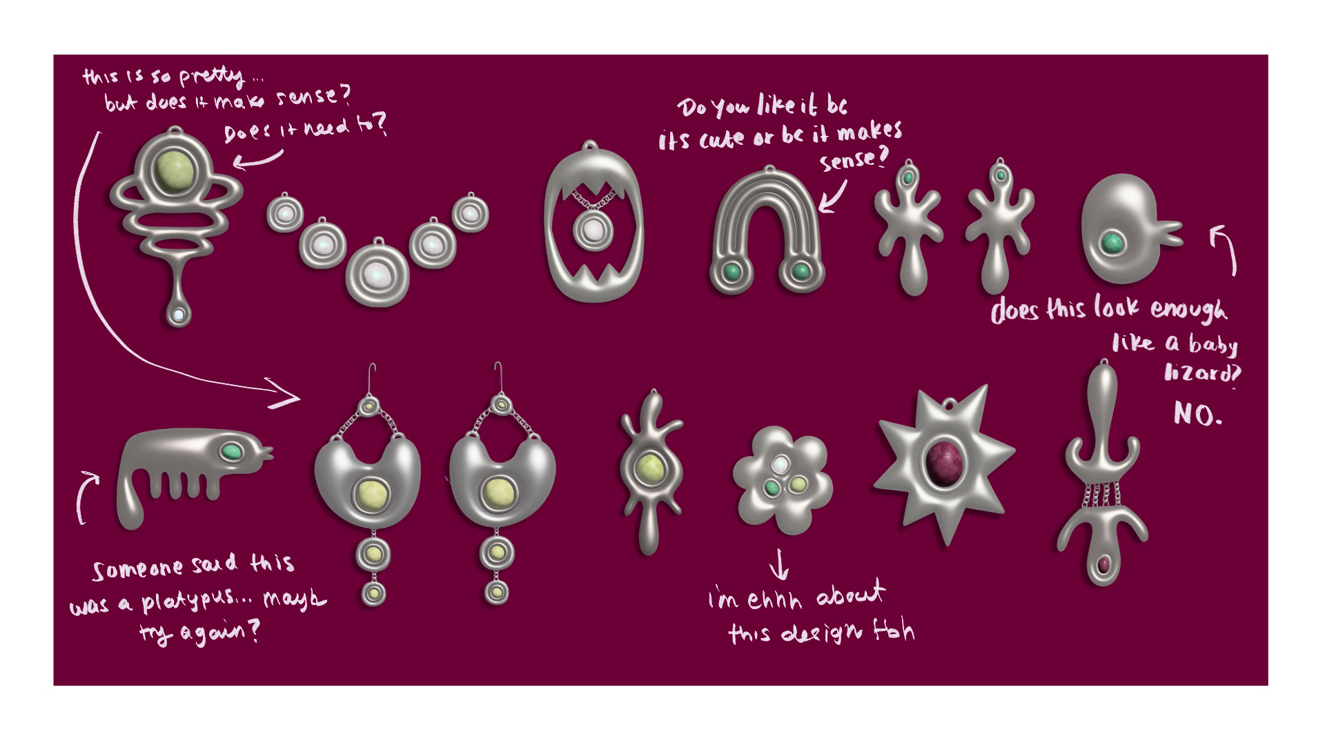
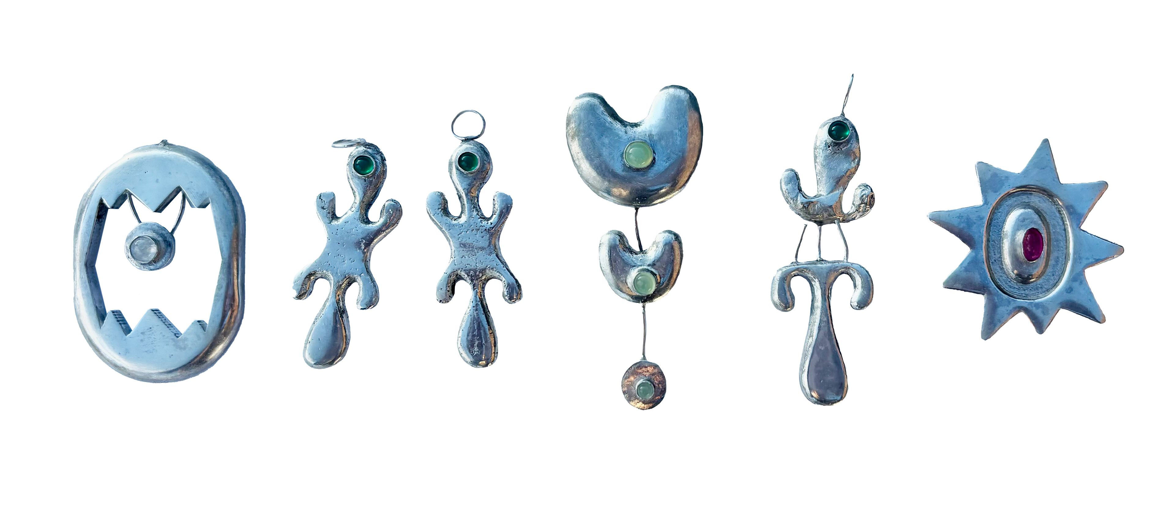
Evie set each piece with carefully considered gemstones, and the collection was complete.
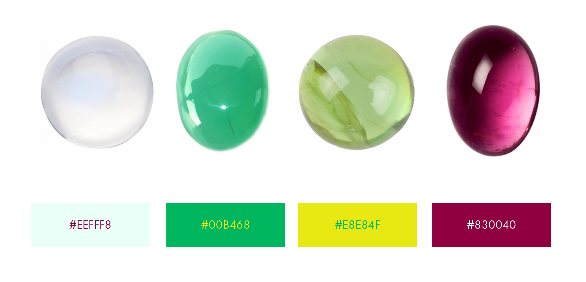
After finishing the collection, I decided to push the project further by branding it with its own unique colors, word mark, logo and pattern. The chosen colors mimic the hues of the stones within the collection itself.
Moonstone, Green Onyx, Prehnite and Tourmaline were carefully chosen. New beginnings, mental strength, unconditional love and healing are properties of the stones, only propelling the story of the lizard.
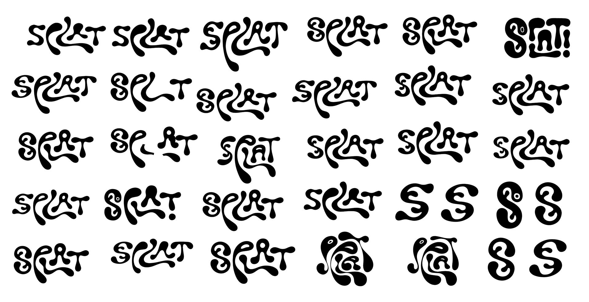
The word mark process revolved around the organic quality of the jewelry and original illustrations. Roundness, curves and a design filled with movement was examined.
The final word mark aims to mimic the physical splattering of roadkill itself, while maintaining a playfulness that can be eerily received. The collections exploration into both life and death balance emotions of happiness and tragedy, as does this final mark.
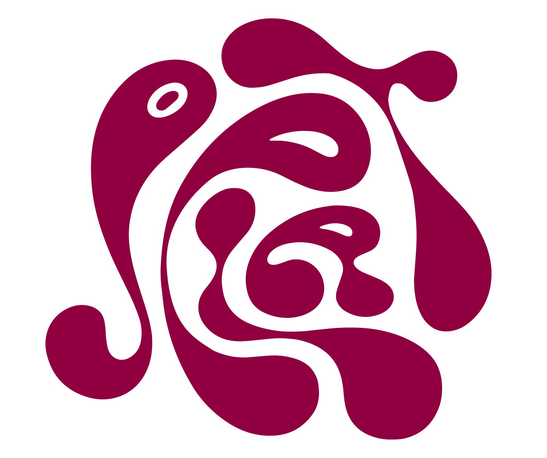

The logo is plucked intentionally from the word mark and stands alone as both an "S" for "Splat" and as the lizard itself. The logo is simple, bold and scalable while also maintaining strong personality.
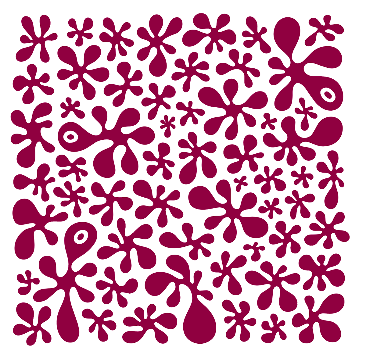
A variation of the logo was duplicated, reworked and then further multiplied to create a brand pattern. These shapes push the theme of splatter and nod yet again to this underlying theme of roadkill.
Further investigation of how this brand might function on a digital platform followed the branding process and concluded my investigation of illustrations place in the world of silversmithing and art as a whole.